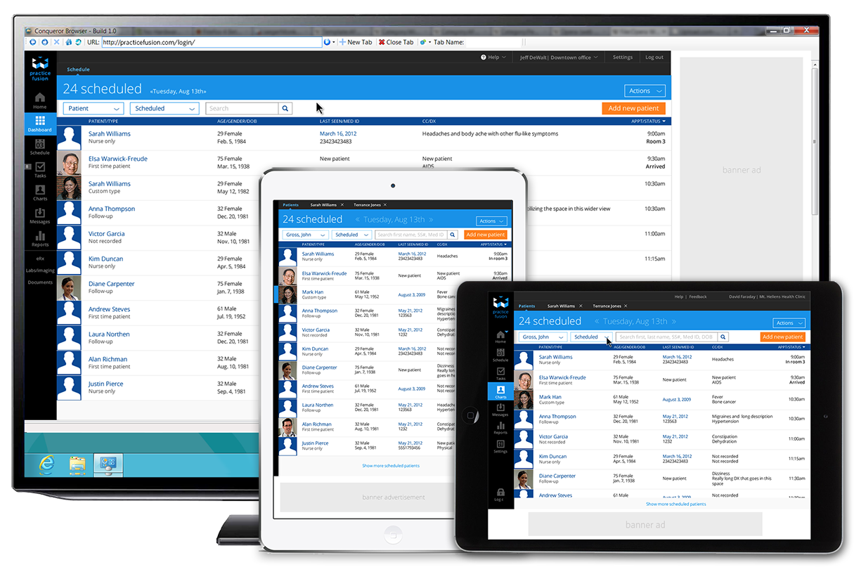
One of the big motivations for the redesign was to escape the desktop. The existing platform was built in Flex which meant it couldn’t run on any apple devices. Many users expressed a need or desire to move away from a purely desktop solution and allow their doctors and nurses to use an iPad in the room when conducting patient visits. Many doctors offices would continue to use existing desktops or laptops for support staff such as the front desk. Many other offices would simply continue to use the hardware they already owned and expected a continued great desktop experience.
We focused initially on designing for two tablet orientations and a larger desktop layout, as our users indicated this was the most significant need. We did some early design tests to give us confidence that we could leverage breakpoints for a later design which addressed phone needs.
The responsive design leverages the screen real-estate by scaling the banner ad and placing it in the least disruptive place relative to the application content.