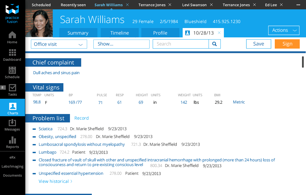
In the original system, data in the interface reflected the database structure on the back-end. In the redesign, data was integrated into a clinical workflow so that it appeared when and where a clinician would need it.
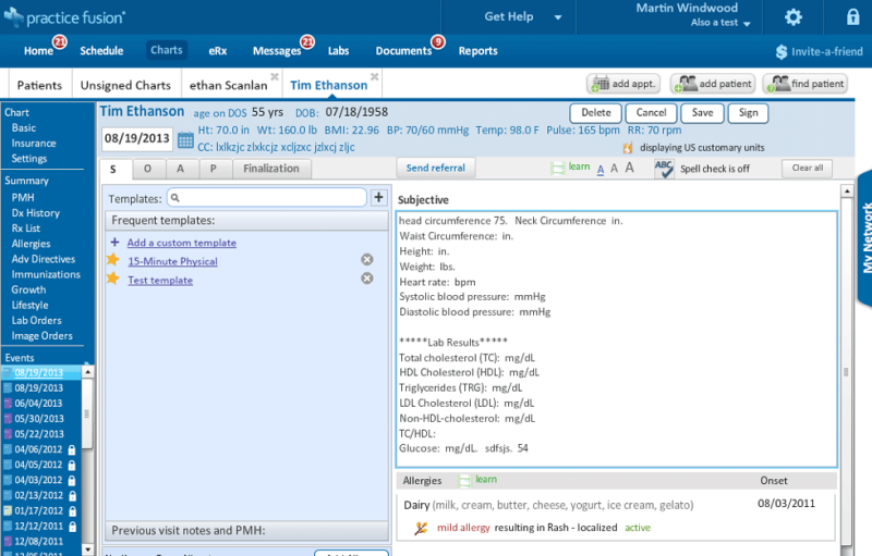

Existing product (left) forced users to click through menu items on the left to review or record information. New design (right) presents users with a single long scrolling page.
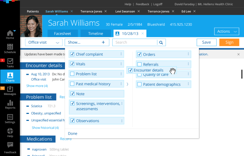
In the new design, all of the items which previously existed on the left are integrated into the page. As users scroll down they review the existing information. It acts as a prompt and reminder to update the information while talking with the patient.
Single scrolling page for a clinical encounter allows physicians to see everything they need for a typical encounter in one place; eliminating the excessive clicking and context switching required from existing product.
Problem it addresses
The existing product provided access to individual types of content via a menu on the side. The navigation work meant users either ignored the items (leaving much of the record empty) or complained about ‘too many clicks’. The existing product provided no option to customize which items were available, forcing a single workflow on all variety of specialists.
Why this approach solves the problem
By consolidating the entire record into a single customizable page users can simply scroll through the content. It’s less work than clicking and encourages users to enter information where the record is blank. It also acts as a check-list for the encounter making all encounters more complete.
Allowing users to customize what elements are included as well as the sequence in which they are presented, the encounter screen can reflect their specific workflows.