“We don’t finish the movies, we just release them.”
— John Lasseter of Pixar
It’s easy to think of design as an ongoing iterative process, a constant refining that never reaches an objective “end.” It is especially easy to think of software in this way. Because code isn’t static, design of software is relatively dynamic, able in many situations to alter direction or incorporate new functionality without overturning initial design-framework decisions. While this can be true, it is also possible for design to reach a state which is done. Not simply done for the next release, but where design reaches finality. The design no longer carries the evolution of the product forward.
Once design reaches a stage in which the difference between versions is more window-dressing, or a change in interaction approach, rather than a realization of deeper functional improvements, design is done. When the ideas on how to improve a design no longer come, when the designers can no longer see a way to improve the idea, it is done. It isn’t that someone else couldn’t take the idea and evolve it, but that the stewards of the design reach a point where their collective imagination can’t move the product forward.
Design which is not done
It’s easy to find examples of design which isn’t done. Lots of first generation software is released delivering basic functionality. Later versions fill out with functionality, growing to meet the latent potential in the first version. This design isn’t done.
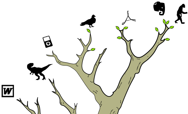
Early designs of Evernote promised much more than was delivered. Successive versions cast and recast the design until the initial flaws could be worked out. Early versions provided little more than a limited word processor that stored stuff in the cloud. The interaction paradigm was a little strange and frustrating. Evernote continues to be a design in process. Functionality continues to evolve and improve with each release; the design isn’t done.
Mature software may not be done either. Photoshop versions 5, 7 and 8 delivered significant design shifts. Paradigms for working with text, the inclusion of vector images and interface for handling of RAW images marked major departures from previous versions. As an 11-year old product the design of Photoshop accomplished remarkable adaptation and revealed the “incompleteness” of prior designs. Of course the design leveraged advances in technology which were not available for earlier versions, but that’s the point. The design wasn’t done, design could still be used to improve the program, to advance what it did and how it did it.
Design of non-software products may also reveal a level of “not done.” A baby stroller from BumbleRide is “done” in the sense that you can purchase one and it works. The design is largely coherent and shows evidence of finish. But even here the design isn’t finished. A comparison of the 2008 and 2009 versions shows significant advancement of the design even though each of the versions was sold as a completed design. Wheels gained quick-release, the safety harness adopted a single button release, and the sun hood extended for more coverage. So is the design done now? I’d argue no. Improvements in ergonomics, materials, and signage all provide ripe areas for the design to continue to evolve.
When it reaches “perfection”
Design isn’t done when it reaches a pinnacle of efficiency or goodness. Done isn’t really a measure of quality or perfection. Many products never reach any level of quality or refinement. They represent evolutionary dead ends, still-born ideas with no potential in which to grow. They are poorly conceived, even if executed well. Crappy products may arguably be done before they are ever built or coded. The lack of vision from the start dooms the product to an evolutionary dead-end before it’s even born. If perfection is the measure of done we don’t have any way to agree on what is perfect or good. Perfect doesn’t give us a way to evaluate done.
When it feels done
Subjective evaluations by the creator may be acceptable in the realm of art. Artists work until the piece is “done;” till they feel the idea has been expressed. Design of products whether software or hardware need more objective measures than feelings. In part, designers need this because the act of creation relies on a whole team, not just an individual. We also need measures because products exist in a marketplace; there are deadlines, ship dates, feature sets, marketing and sales efforts, which require more clarity around when the design will be done.
When the time or money runs out
For consultants, work is “done” when the contract (time) is up. Projects are scoped to meet specific deadlines and requirements which fit those timelines. Design deliverables are iterative, each pass we give moves a level deeper and we work out more of the design details. We give great value for our time, but design is “done” when we run out of time. Our design is rarely done in the sense that every detail has not been worked out, all the possible problems have not solved. We work down from larger more fundamental patterns and frameworks, iteratively filling in the details. The big picture may be done when we deliver, but often it is internal product owners or developers who will actually “finish” the design.
When the requirements are met
It could be argued that design is “done” when the initial requirements have been met. It’s done enough to release a version, but it’s not really done. After the product ships the design team refines the design, adding in features or fixing issues which shipped in the previous version. The designers work to fulfill the full potential of the product. As long as their work produces advancements the design isn’t done.
When innovation plateaus
Design is done when its evolution plateaus. A couple of versions are released with little more than rearranging the deck chairs. Rework or changes to the interface reflect passing fashions rather than fundamental shifts in direction or functionality. Innovations in the marketplace or in technological breakthroughs are not incorporated or addressed in the design. Evolution grinds to a halt, the product ceases to advance in meaningful ways.
Design continues on many products long after the design is done. Design effort is wasted in chasing a market rather than leading one. Products become bloated with features which compromise the clarity achieved when the design reached “done.” Features are designed which don’t evolve the product; they complicate the vision reaching to be all things to all people, ultimately hobbling the product. The design of Microsoft Word has delivered little beyond version 5.1. It is a quite usable word processor, but the design for word processing was solid in 1991, in the subsequent releases little was advanced. Features where added that did little to improve the word processing experience. The design also failed to take advantage of shifts in the marketplace or technology. Five versions later Word is still largely a pretty good word processor. While much has changed in the interface switching interaction paradigms from menus to the ribbon can hardly be thought of as a fundamental shift in functionality. Word hasn’t evolved so much as changed it’s wardrobe.
Some products manage to react to changes in technology or marketplace. The design accommodates changing needs and opportunities. The product evolves through design to include new functionality, utility and continues to add life to the product. While Adobe Acrobat Pro has struggled with its share of bloating and incessant updates, the design of the program has continued to evolve. From humble beginnings of a reader/writer for portable documents, Acrobat has incorporated new functionality unimaginable when the product was initially designed; OCR of text, automatic creation of interactive forms, document markup, digital signing and distributed workflows. The integration of this new functionality has stumbled at times, but Acrobat X delivers a coherent, usable evolution of a product that is more than 17 years old. What was just latent potential in the embryonic design of the first versions of the product has been realized.
Some products are so deeply bound to a specific paradigm that the only reasonable evolution is an entirely different approach. The original design is done. A new product, with a different design, is created to address new technology, and a new marketplace. The original iPod‘s design is done. The scroll-wheel/menu design of an mp3s player was groundbreaking and brilliant, and it was well-executed. At some point it became clear that this design was done; it couldn’t evolve while maintaining the same core design. The only road forward was to abandon this “done” design, and adopt a new paradigm. The result was the iPod Touch. The shift was more than simply adding a bigger screen with touch input; what the product could do radically shifted.
Why does it matter?
It is important to acknowledge that design can reach a place of “done.” If we don’t, we may end up fooling ourselves that we are moving products forward when we are really just treading water. If we can’t step back and evaluate whether a design is done, we may continue to put effort into a product which we can’t improve. We will continue to release products that don’t help people achieve their goals, or worse–damage great products by bloating them with features no one needs. Knowing when the design is done allows us to recognize when our efforts will be productive and when our efforts will be wasted. When design is done it’s time to move on, to take up new challenges or products and start designing again.