I was given the opportunity to lead a top-to-bottom redesign of our EHR. The goal was a responsive design that is mobile and desktop friendly, that is modular enough to support gradual expansion of our core business into a fuller offering.
This wasn’t blue-sky design, rather the task was to reimagine the system we already had; success would be gauged on engineering speed, re-using our earlier investments, rather than fundamentally reimagining how one might design an EHR.
Role: Lead (executive stakeholder management, organizational buy-in, communicate the vision); Interaction design (design framework, contributions to patterns, design collaboration/ideation)
Project
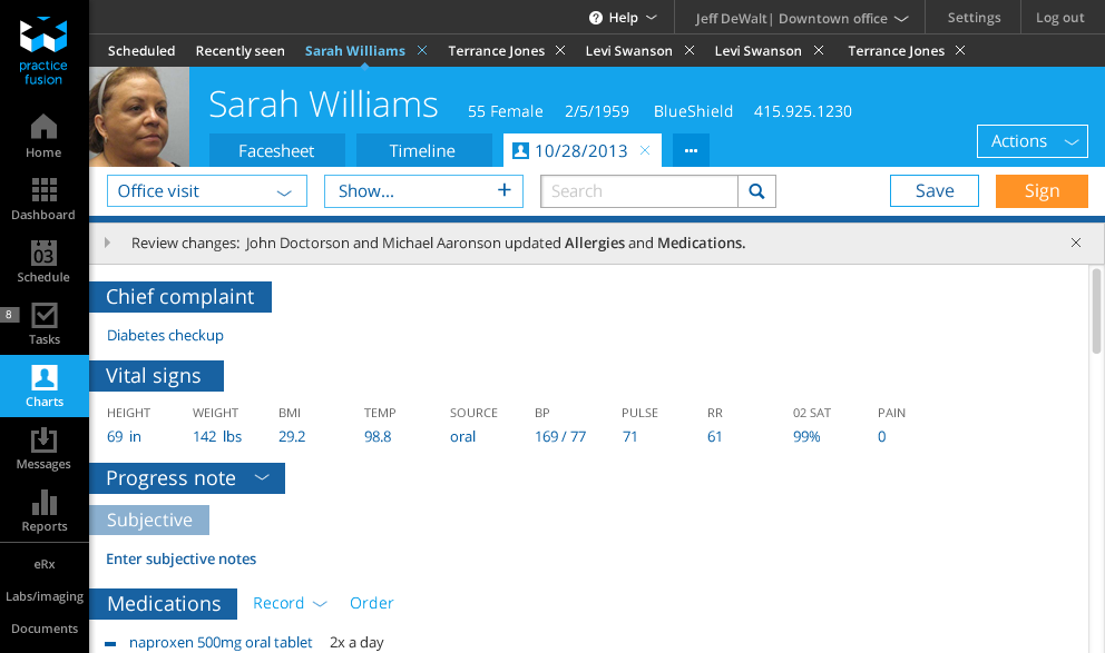
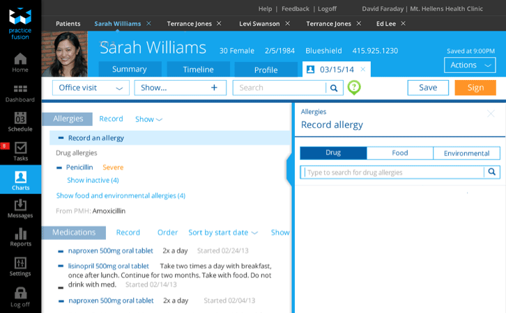
For seven years Practice Fusion’s flagship product was a cloud-based healthcare application called an EHR. An EHR is a kind of ‘operating system’ for the doctors office which supports the digitization of medicine, from booking appointments and submitting bills to documenting care and prescribing electronically. Practice Fusion’s EHR has over 100,000 users and 60 million patient records; it’s a system with a lot of usage and a big investment its data structure. When the Practice Fusion’s EHR was conceived the best available technology to deliver the enterprise level complexity and responsiveness was Adobe Flex. For years this allowed the delivery of a single set of code, over the cloud with performance that made it best in class. Much has changed since that time. The original version of the EHR was showing its age, HTML 5 had made serious advances, and users expected mobile access to an EHR. The old system simply didn’t have a way to move into the future.
Goals
- Leverage organizational investment in underlying data structures and technical architecture
- Create a single design framework that equally supports a tablet (touch) and desktop (keyboard)
- Improve the efficiency and effectiveness of doctors who use the product by making it better support their workflows and needs of their practice
- Incorporate long-standing user requests for features and functionality
- Improve every feature we ported to HTML-5; we described this as “parity (with existing functionality) + 1 (something new + better)
It’s worth noting that this is a terribly ambitious set of goals. As a set they place significant starting requirements on every single design decision.
If I had to do it over again I’d reconsider trying to design a single framework that makes for an awesome desktop and tablet experience. It’s a really noble goal and I think we’re doing a decent job at realizing it, but every day we are confronted with ugly decisions or tradeoffs we need to make in order to support both ways of interacting with the system. You try to make generous use of templates and touch friendly spacing and lots of automation for tablets; and for desktop you try to leverage key commands and hover and much denser information display. Both feel really out of place in the ‘other’ environment.
Improving every feature you port seriously compromises speed of development. From a design perspective you end up wanting to change things as you redesign them, especially if the original version is clunky. But this adds work for development. Developers are improving code as they rewrite it everything’s much tighter and scalable, but when you start improving features, not just porting them, you often find you’re basically just doing new feature development.
Leading by design
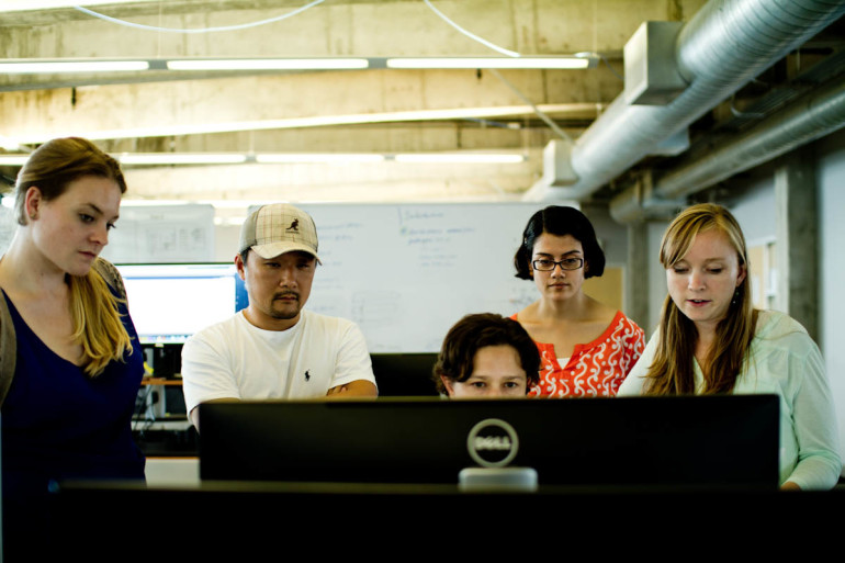
As with all large products it takes many people to create and develop them. The UX team has the charter to lead the articulation of new products, features and functionality. We do this with product vision from the CEO, support from user research, collaboration with subject mater experts (in our case a medical informatics team), partnership with program managers and deep integration as full participants on the agile scrum teams that engineer the products.
The UX team creates the artifacts which allow the rest of the organization to start a conversation about what to build. This isn’t a waterfall approach — we release every two weeks, but it does mean that the organization works from pictures into stories and requirements. It means that for roadmap planning we use images depicting possible features to come to agreements rather than spreadsheets or charts.
Process
Starting from a tablet prototype
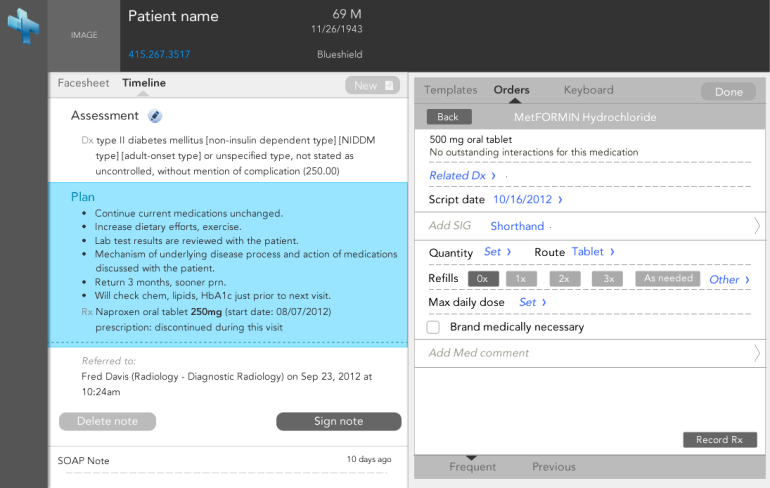
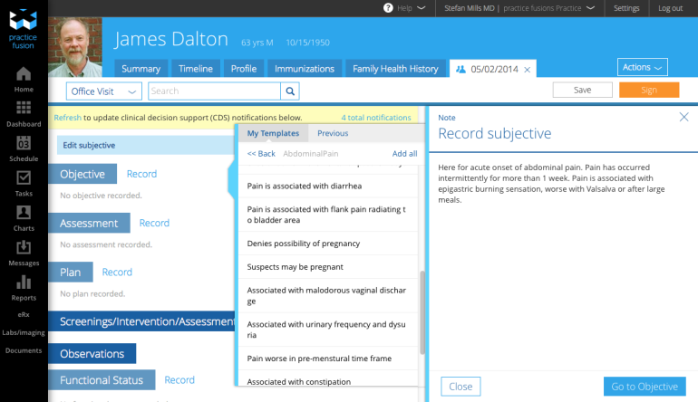
Where do you begin this kind of redefinition? Practice Fusion had already invested in a prototype (designed and built by a design team at Cooper, of which I was one of the designers). The Cooper team had worked through some of the hard problems when reimagining the EHR in terms of a tablet/touch interface. The Cooper team had also focused on a core workflow — documenting an encounter. We started from this work as a base.
Mapping the system
Having a tablet friendly start for a design framework and a single workflow was good, but it hardly represented the complexity or depth which the system would need to support for all existing EHR functionality, let alone the new features we wanted to add. To figure out the gap I mapped the existing system, every single page, every setting, every workflow that a user could perform.
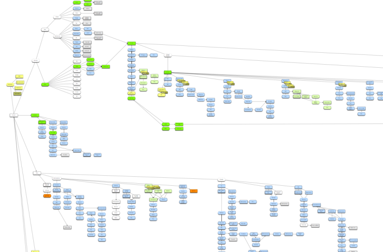
It took a week. I mapped it as a giant flow chart of pages, tabs, and actions. If I came across a feature I didn’t understand I asked someone who could explain it to me. If I came across something that seemed broken or convoluted I noted it so that I could return to it.
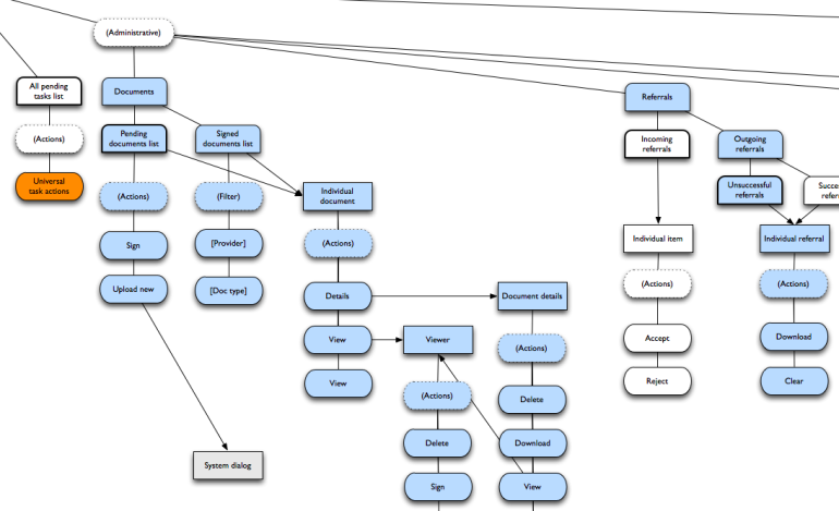
Next I moved existing pieces to fit the new framework. This meant adding new branches and moving lots existing branches around. I wasn’t focused on tracking the migration of each screen which allowed me to work quickly. I reworked the flows that seemed convoluted, I standardized sequences and actions. I made a map of what the system could be given the new framework. I accepted that the map was imperfect. Much of the value was in simply booting the entire system into my head and working through some of the rough spots conceptually. The mapping exercise showed that, theoretically the new framework could support existing features.
Trying out some of the hard problems
These were early days, and the design team was small and everyone was working on features that were shipping in the next sprint. I took lead in doing some design experiments with the new framework to see if the mapping could actually fit into an interface. The goal of these experiments was to build a few sets of screens that tested the system in ways we knew it had to eventually work, but weren’t exactly sure how it would come together given the new framework.
I also explored workflows through the system to test if the framework would support the kinds of interactions and navigation users would need to use.
Knowing that we wanted to not simply port features, but to improve them, I also explored potential ways we could evolve existing functionality into richer experiences.
These, and many other experiments gave us confidence that the framework was practical enough to not prevent us from solving these kinds of problems. This work was done quickly (a number of weeks) and with the express intention of not ‘solving all the problems’ or arriving at a perfect design, but simply as a prototype to give confidence in the flexibility of the framework.
We were also waiting for a rebranding project to finish so that we could finalize on a visual design for the new product direction and so the visuals from that timeframe have a generic look and feel to them.
Deriving design principles
The original Cooper team had done user research to inform their design decisions. The now extended framework included design imperatives which were not necessarily explicit, but which guided much of the design work. I combed through all existing design and research for this framework and derived a set of design principles which could be used by other designers to extend it.
Beta testing the framework
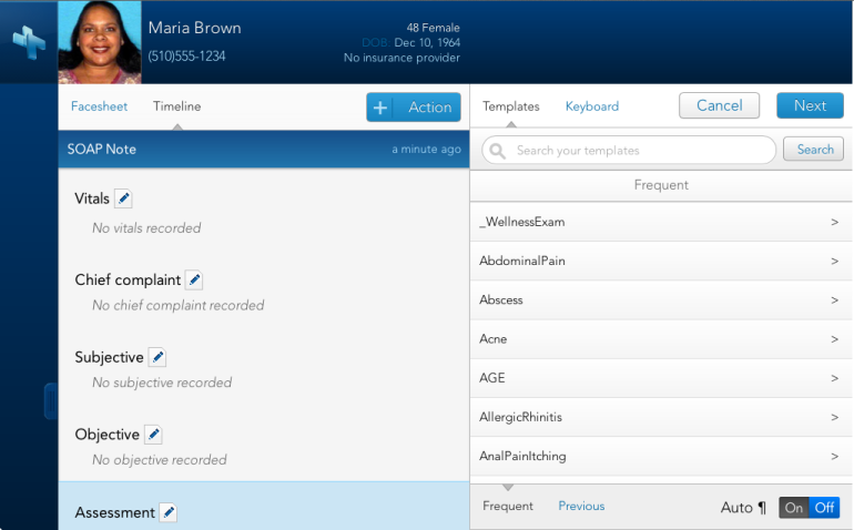
I worked closely with one of our scrum teams to develop a very limited functionality HTML-5 version of our product that would work on tablets as well as desktop. Like the tablet prototype from Cooper we stayed with a key workflow (documenting a patient visit) to limit the scope of the effort. We released it and while it lacked most of the functionality of the EHR a small and dedicated user base adopted it, helping prove that a live version of the design framework could be understood and adopted by users.
Picking a path to production
At this point the tech organization had to make a decision about how we would tackle redeveloping the underlying architecture and new user interface. While there’s many other options we could have considered given our organization and capabilities we examined two different paths we could take.
- Pick a couple of scrum teams to build a new version of the EHR and continue limited patching of the existing product. The new EHR would be available as an optional beta product with limited functionality. This approach would mean the effort would go slower, we would essentially be building parallel products for awhile. We would be forced to sequence the work to support user access to functionality in the new product (spending a lot of up-front time rebuilding the base system before we could provide access to new and interesting features). It also meant that at some point we’d need to migrate millions of records over to the new product.
- Essentially sunset development on the existing product and put all development effort into creating the new product. We’d rewrite code and migrate features over a little bit at a time. We wouldn’t need to support two products at once. Features would be released as they were completed, giving all users access to anything new we developed. This would mean that for a time users would have a disjoined user experience, moving between the old and new frameworks, a feature or workflow at a time. But the tradeoff was that we could get everything over to the new design more quickly.
These aren’t easy choices. There were a lot of good discussions around this decision. I strongly favored 1) building a beta product which was distinct from the existing product because I was uncomfortable with delivering a user experience of one product with two distinct frameworks; the transition time would be hard on users. But that was largely the only benefit that that approach and the tech leadership went with 2). Incrementally role out the new framework to all users and phase out old features as we progressed.
Going with a disjointed user experience meant we needed to address the issue head on. We employed a number of different approaches to manage the impact on users.
- We did lots of user previews of design before getting it into code. We got feedback as early as possible to gauge the impact on users. We posted design flows on user forums to allow for comments.
- We marketed coming changes to users and helped educate them on what the changes meant for their workflows.
- We developed in-product training and educational videos on new features.
- We committed to releasing new features as optional when we weren’t confident that they would support users fully.
- For features that couldn’t be optional we agreed to hold their release to users till they were robust enough to serve users well.
Production
Now that we had a design framework and a plan for migration the real work began. The entire UX team began applying the framework to the features they were working on.
We learned a lot over the next few months as the framework collided with reality. At a high level the framework was really solid. It was practical enough to flex to the requirements of rich features and wild edge cases. In the details lots of things had to be figured out and in many cases rethought. This was a time of intense collaboration for the design team. With everyone trying out and applying the framework we had lots of design meetings to evaluate how it was working.
We did lots of whiteboard sketching to explore ways of solving the new problems that emerged.
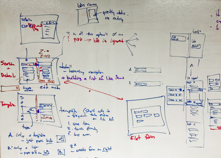
Every designer faced unique problems on the parts of the application they were working on. Many were forced to invent new design patterns because no one else had solved it yet. One designer took lead on defining the way the framework fit into a bootstrap grid. Another defined the way all features would interact with settings. Someone else picked up navigation within a section of the application, and someone else applied the framework to reworking an existing feature to be released to users in the next month.
We shared our progress in many ad hoc meetings around a designer’s desk. We deliberated and expanded patterns in weekly design pattern meetings; 1-2 hour meetings where designers would share their latest work and discuss what it meant for the rest of the system. We codified patterns on a wiki so that everyone had a shared frame of reference.
Many early releases of the new designs were integrated into the existing product via modal windows. This was both because it was expedient and because the larger navigation framework hadn’t been engineered and a modal allowed the functionality delivered without delay.
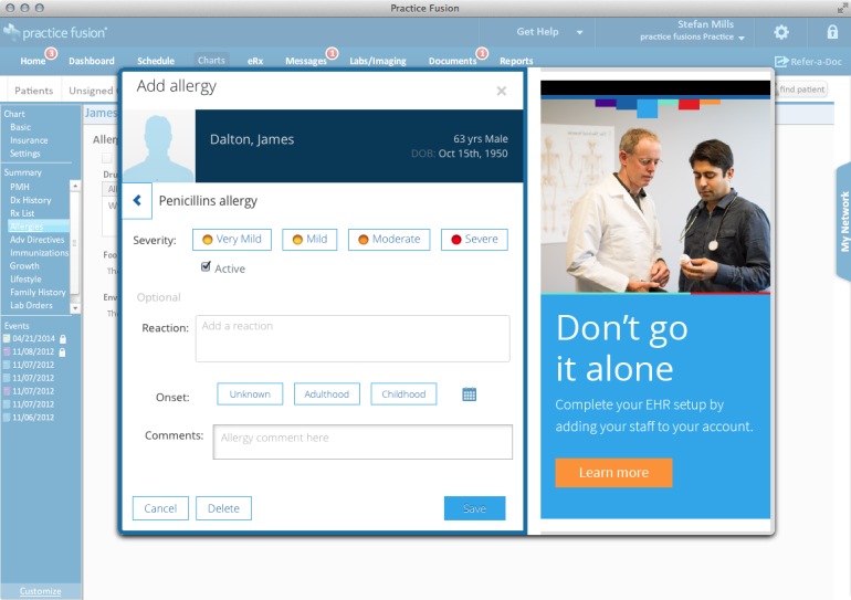
We found that the modal windows acted like a design crutch because you started designing around a modal experience instead of for a fully integrated one. Modals are essentially contextless so you don’t worry about making the flow smooth on entry and exit. You might nail the internal experience, but the design didn’t really translate into the final framework well.
Introducing new features
Entirely new features were designed to stand alone and present to the user as something much closer to the final experience. While this gave the user a wildly different design paradigm it gave access to new functionality. We found that many of our users would accept the massive shift, so long as the functionality was worth it.
Replacing old features
Users were much more vocal about any change in experience when they were accustomed to how an existing feature worked. When we made changes for these workflows we did lots of upfront testing with users to gauge how the new experience would be accepted. Not every release goes smoothly, and for some where functionality needed to be cut at the last moment or the feature was buggy users were quick to let our team know their dissatisfaction. Our goal in these situations was to as quickly as possible design a solution or correct code so that we could patch and improve the experience.
tl;dr – what did you learn?
- Redesigning any system isn’t a task to be taken lightly. Assuming you’ve got people who are using the system they are going to resist change, no matter how much of an improvement it is.
- Big systems aren’t easy to change quickly. Even if you have a good sense for the roadmap there’s always a lot you discover as you work that takes longer or is harder to do than you anticipated.
- Design is just one perspective in shipping products. What might be an unbreakable truth for a designer might be a total distraction for a test engineer. What a stakeholder wants might be directly counter to what user testing tells the design team. If you want to build products with other people you need to be awesome at your craft but also really good with your communication, collaboration and negotiation.
- You never design the details right on the first try. You might have the start of a good idea, but it isn’t until it’s in code and in a user’s hands that you really see how it should work.
- Users are resistant to change, but are surprisingly able to get over their dismay if their work depends on it.
- When designing systems with others it’s imperative that everyone shares their work regularly. Just two designers over the period of a day produce many hours of product that the other knows very little about. Sit close, get feedback often, don’t reinvent what’s already been done.
- Mapping a system is a good way to learn it. It doesn’t replace doing work in the system, but if you take the mapping exercise seriously you can learn a great deal from drawing the relationships.
- Draw pictures of possible future states for the system. They force you to confront realities that you hadn’t considered when you were talking about plans. Draw flows to test interaction assumptions.
- It’s better to do some design, then derive the principles as opposed to writing up a bunch of principles and then trying to design to them. They are concrete and meaningful if you derive them; they are abstract and disconnected if you propose without something you’re referencing.
- Don’t think you know it all. Listen to your users, your stakeholders, your subject matter experts. Be curious and assume good intentions. Don’t let people do your job for you, but know when to get perspective and information from people that know more than you do.