When I arrived at Cooper they had a well established house style for deliverables: Text heavy, dense, visually conservative, printed and spiral-bound research documents and design specifications.
I advocated for and defined a new approach to deliverables: Research documents with heavy use of field photography; bold visual styles with clean information graphics and data tables that reflected the brand colors, fonts and styles of Cooper. Where possible I created movies, prototypes and posters; formats that engage the audience more deeply.
Role
- Visual and conceptual design, developed templates and content style
Before and after
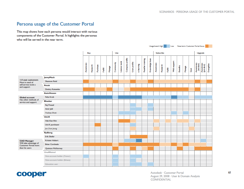
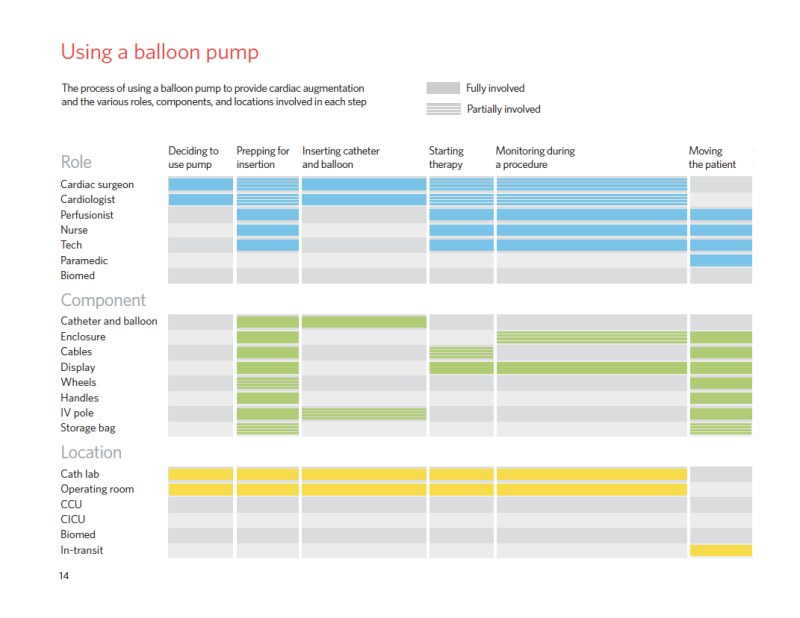
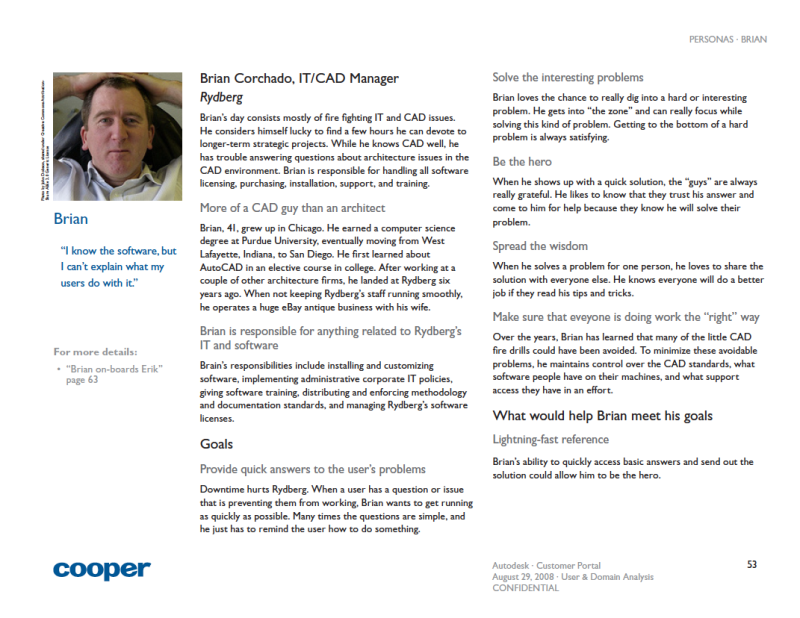
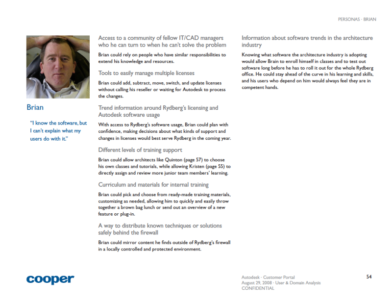
Before: text heavy, dense, not scannable; After: Scannable, clean, good hierarchy Before: Wordy research findings; After: Text and images which highlight and give visual support for findings Before: Dense charts, small text, dull colors; After: Readable charts, bright colors Before: Wordy persona introductions; After: Bold persona introductions, visually compelling and engaging layouts Before: Wordy persona descriptions; After: Scannable persona descriptions, just-enough copy